

Web design trends change every year, and as website designers, it’s crucial to know what trends are popular so you can stay ahead of your competition and meet your clients’ needs. Remember, “trend” doesn’t necessarily mean “new,” just popular.
But before we take a look at what’s gaining attention, let’s first look at the web design trends of 2015, as many of them are being refined and will reemerge this year with a new face.
- Responsive Design
- Video
- Infinite Scrolling
- Typography
- Minimalism
- Flat Design
Some of these trends have been replaced, while others have evolved and improved as web designers equip better technology. Many refined processes will become the standard norm this year.
Now let’s take a look at what to keep an eye out for in 2016:
Mobile Responsive Web Design
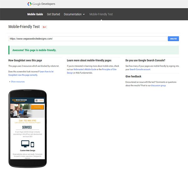
We just tipped the scales last year when Google announced more search inquiries are being conducted through mobile devices than on desktop computers. In the United States alone, 94% of people with smartphones search for local information on their phones. What’s more is that Google announced it will give higher ranks to responsive websites (that is, websites that pass Google’s standards for mobile friendly viewing).
So that means avoiding any content that requires Adobe’s Flash Player, ensuring the website is readable without zooming, and separating content with white space so links can easily be clicked.
And for those of you still a little confused about how responsive design differs from dynamic serving or having a separate mobile URL version of your website, remember this: Responsive web design serves the same HTML code on the same URL regardless of the users’ device (desktop, tablet, mobile, non-visual browser), but can render the display differently, or “respond” based on the screen size.
Responsive design has a focus on the mobile user’s experience. Certain desktop features become hidden when viewed from a mobile device, allowing for clean minimalism. Images, buttons and menus are all designed with the mobile user experience in mind. These elements adjust and “respond” depending on the screen size and type.
Unsure if your website is responsive? You can check it here.
User Experience (UX)
The overwhelming majority of visitors are less likely to revisit a website if they had a bad user experience. So trends will continue following the best practices for UX and mobile. These 2 forces are center stage and are driving web design trends toward an uncluttered user interface. Consumers expect companies to fulfill their needs in real-time. So any web design practice that reduces page load time will be favored as more and more users opt to view websites from mobile devices.
The overwhelming majority of visitors are less likely to revisit a website if they had a bad user experience

Not only will web design cater to the mobile viewing experience, but the mobile user experience as well. Designers are now considering elements as they never have before such as the amount of pressure necessary and the use of various touch gestures like 2 finger tap, swipe, or finger spread to perform actions.
Video Integration
The use of video is becoming more impressive as developers learn to integrate it into a design with animation. Use it to show off a product on your website or in a tutorial of how to use your new app. Both uses enhance the user’s experience.
Typography
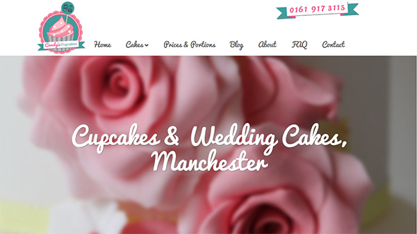
Handwritten script has emerged this year as a popular web design trend. The personal touch that handwritten typography adds can make a company stand head and shoulders above the competition.
The only caution with implementing this trend is legibility on small screens. One solution would be to display typography based on screen resolution. High-res screens would showcase more elaborate typography whereas lower resolution screens would revert to a more legible font.
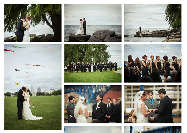
Card Style Layout
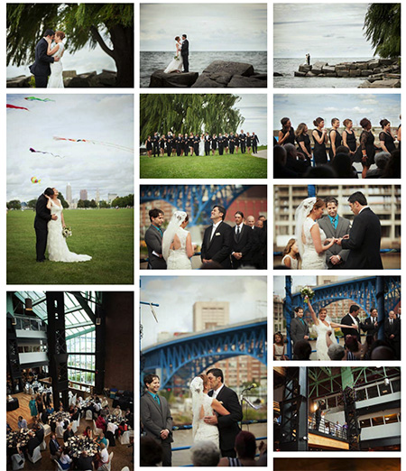
This web design trend is popping up EVERYWHERE. It stemmed from using more images and less text to navigate the user. (Oh, and Pinterest helped a little, too.) Now it’s used to showcase portfolio pieces, blog articles, services, products and any content you can slap an image over.
Simple marketing tells us people process visuals faster and consumers would rather look at an image than read text. The only drawback is balancing text rich SEO and delivering a pleasant user experience. Search engines index text but it’s more important to target your user. When in doubt, always cater to the human experience. If you’re using lots of images on your homepage, just be sure to compensate by giving search engines plenty of text rich content in your sub pages.
Marketing tells us people process visuals faster and consumers prefer to look at an image than read text
Of course, the most popular trend is not always the best solution, so don’t stray from a classic design trend if it converts and works well for you. What emerging web design trends have you noticed this year? How do you believe they will evolve in 2017? State your opinions and forecasts in the comments below.
Comments