Posts Tagged ‘Website Design’

Top 2015 Web Design Trends

2014 introduced a lot of new technology and evolution in the web world, much of which will become a staple in this year’s marketing and design. We at Vegas Website Designs pride ourselves on delivering the latest user experience and want to keep you informed of the top web design trends for 2015. Resolved to improving your online presence this new year? Take a look below to gain some insight as to what to budget for when revamping your website.

Responsive Design

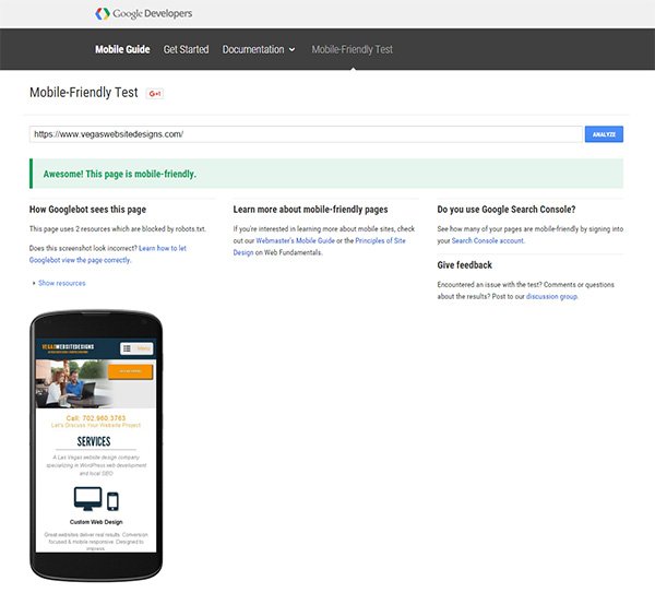
I’ve said it before, I’ll say it again: for those companies still lacking a website that functions on mobile devices, you are missing an entire world of opportunity! There will be 2 billion smartphone users by 2015. The concept of responsive design was pushed at us back in 2012 as mobile users multiplied, but if you don’t implement this web design trend in the coming year, there is a real probability you could start to see a decline in profits.

This design trend isn’t going anywhere. In fact, it’s growing. A shocking stat from ONE shares that more people have access to a mobile phone than a toilet! What’s more is that 3/4 of those mobile users in the U.S. admit to taking their devices with them in the bathroom. So if you want unlimited access to your customers, taking advantage of responsive design will certainly get you there.

The Rise of Video

web design trends video

Make friends with this valuable content tool this year by incorporating video into your business website. With customers wanting to spend less time making a decision, implementing video tutorials and how-to’s certainly speed up that process. Another great way to make the most of video content is to use it to tell your story. Visual content is one of the highest effective methods when it comes to customer engagement, so creating a video about your company that shows off its standards, processes, or kick-ass office space is an excellent way for customers to relate to you.

Another fascinating way this web design trend is being used in 2015 is through HTML5 video. Instead of having a static background image on your site’s main page, an embedded video runs in the background, grabbing your customer’s interest from the start. And the longer a customer stays on your site, the more invested they become. Plus, it gives your business a modern, high tech vibe that gives you a leg up over your competitor.

Infinite Scrolling

Users like to scroll. And it’s easier for customers to get all their information on one page than to click around trying to find it. We’re already familiar with this concept because of social media pages like Twitter and Facebook, so users have come to expect it. And with more and more websites opting for a one page design, fear of poor SEO ranking is dying.
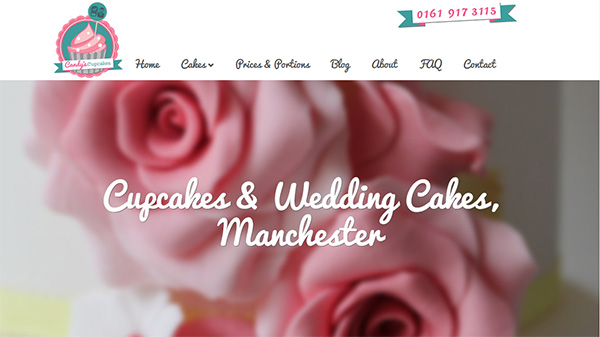
Typography

web design trends typography

Large, unique typography has become standard. With the endless possibilities of typography design out there, there is no reason a business can’t be personally branded. When coupled with a large size, your unique typography will make a statement that can’t be missed. So make sure the most important information is captured using this technique.

Simplification

web design trends simplification

Everything you need, nothing you don’t. That’s the design mantra websites are taking on this year, mainly driven by the small screen sizes of mobile devices. There is no longer room for fancy bells and whistles if you’re trying to convey what’s most important on a handheld screen. Removing non-essential design elements will give your website a cleaner, more functional look that will certainly be favored in 2015. And because smartphones aren’t going extinct any time soon, it’s a good idea to slim down your company’s website now and opt for simplicity.

Many of this year’s web design trends are reinforced from last year, but have increased importance as consumers change their shopping methods. What are some of the design trends you have noticed moving toward 2015? If you implemented any of these into your website, what changes have you noticed? Feel free to join the conversation and comment below.

How Much Does a Website Cost?

Amateurs get frustrated with clients. Professionals educate them. A great agency is going to set expectations and educate the prospect from the onset. We get a lot of questions on what the “normal” price is for a website. Truth is, unless you work in the IT industry or have gone through the process of developing a business website before, most people are confused about what a website should cost them.

A big part of this misconception is caused by those designers who flagrantly advertise they can build a website for only $1,000 in just a few weeks. With common advertisement like that floating around, it’s what people have come to expect. Yes, you can have your website built for just a couple thousand dollars, but I’d be willing to bet more than that you are going to be unhappy with it and end up paying a quality designer in the end to fix it, having wasted time, effort and money.

So, how much does a website cost?

There are many factors that comprise the budget of a website project.  For example, the value it will bring to the company, the agency’s reputation, demand and expertise, and complexity of the project. What do you need it to do? If you’re an at-home blogger that needs a simple page for the purpose of sharing information that brings in no revenue from your website, then that $1,000 designer just might meet your needs. But if your company’s website generates leads, educates clients, sells products or services, and advertises for you, then don’t be surprised if a professional designer quotes you anything over $25,000 (especially if you need your website to function on mobile devices, too).

You see, a good developer requires skill that has the power to transform your website into a selling machine! These qualities took time to fine-tune and there’s a level of expertise you’re paying for. Adding custom functionality, e-commerce ability, and forms are just going to cost more. Think of it this way: How much time, effort and money would it cost you to learn how to do these things yourself? Would learning and building it take away from the productivity and revenue of your other projects? It probably would, and so it’s best to stick to what you do best and leave website design and development to an expert (and a quality one so it’s done right the first time!)

Another way of thinking about it is to look at your website as an employee. This is an employee that:

  • Works for your company 24/7 without ever taking a break
  • Is a constant advertisement that drives customers to your business and brings in sales
  • Can be everywhere, all the time
  • Will never quit on you!

Best of all, your website “employee” becomes cheaper the longer you have it. Let’s say, for example, you pay $20,000 for your website. That means after 2 years, you have paid your website “employee” $10,000 per year. That’s an hourly wage of $1.14! And that’s assuming your “employee” has brought in zero revenue to pay for itself. No organization will find an actual employee that would be willing to work the way your website will, let alone work for that hourly rate.

What will I gain if I pay for a professional design?

how much does a website cost

I like to compare cheap website design to a used car. Anyone can have a car for $500, but how far will it get you before you pour more money into fixing it? What do you gain from buying a new car? It lasts longer, maintenance is almost null, and you gain a reputation. The fact is, the majority of people research a product or service online before committing to buy, and if your business has an ugly, $500 “used car” website, your reputation could suffer as being cheap and outdated. Having just any website is not better than having none at all. It’s better to build customers’ anticipation over a new, upcoming website than to risk disappointing them and losing their trust with a cheap one. Besides, if someone told you that by spending $15,000 now would gain you 4 times that amount in a year, wouldn’t it make sense?

Do I really need that?

Be watchful of those agencies that try to sell or quote you much more than what you need. If you’re a blogger, you likely won’t require your website to support e-commerce ability. A red flag should go up if the agency is not willing to work with you. This is a sign they’re selling the same package to all clients. Everyone’s project is different, so the quote you obtain should include only what you need, nothing you don’t (unless of course the agency makes recommendations based on your best interests). Most of the time, you can opt out of a premium feature for your website which will lower the initial cost, then choose to implement it at a later time. WordPress websites are particularly flexible that way.

So, how much does a website cost? Whatever the cost of your company website (and you should expect it to be at least $20,000 dollars), you can be assured that it will quickly pay for itself and its value greatly outweighs the initial investment. The more important question is how much your website is worth to your business, rather than how much does it cost.

Usability: Does Your Website Pass The 5 Second Test?

Usability

What determines whether a user stays on your website? Is your target audience clearly receiving your intended message? Within 5 seconds, the usability of your website will determine whether visitors deem your site worthy of their reading time or decide to abandon ship. Failure to pass the 5 second test could mean lost customers and conversion opportunities. Some commonly-made usability mistakes can be easily remedied by checking your site with the guidelines below.

Load Time

The average online user expects your site to load in 2 seconds or less. After 3 seconds, 40% of users will abandon that site. Nearly a quarter (and rising) of website traffic comes from mobile devices; users are on the move and expect sites to respond quickly. A longer than average load time heightens your page’s risk of abandonment.

Usability

To check how long it takes for your site to load, plug it into tools.pingdom.com. If your site’s load time exceeds 3 seconds, try these changes to improve usability:

  • Use a JPEG for complex images like photos and compress the file size by up to 60% without compromising quality
  • Only use a PNG when you need transparent images
  • Use a sprite instead of individual images to decrease download time
  • Wherever possible, use CSS and text in place of images

Responsive

An enormous amount of website traffic comes from mobile sources and if your site is not responsive, (that is, uniformly viewable on your customer’s laptop, tablet and smartphone) your site appears scrambled on their device and unreadable. Your visitor will not stick around to decode the jumbled mess. Ensure you are avoiding this silly mistake by having one existing version of your site that is clearly visible on whatever platform your user chooses.

Important Information is Above the Fold

The Fold is all the information visible before ever scrolling and it’s the prime real estate of your website. Users spend 80% of their time looking at content above the fold, so that is where all your important information should be. If you make your visitors have to scroll to learn what products/services you have to offer and how to contact you, they will likely leave.

If you have a lot of important content that your customers need to know, try creating a slider on your home page above the fold to convey the information. Separating content between slides is a good way of keeping mass clutter in check. But remember to keep slide transition time under 5 seconds so your user sees it before making their decision.

Informative Headlines &Titles

If your users can’t find who you are and what you have to offer, they are not going to search for it. 8 out of 10 people read a page’s headline, yet only 2 out of 10 read the first paragraph. So be certain information such as who you are and what you do are positioned obviously in as few words as possible. For relevant examples of how to do this, check out my article Top Web Design Trends for 2013.

Usability

Visually Attractive

Engage your audience’s visual attention with a large, stunning image that portrays your product or service accurately and conveys the message you want to send. Strategic placement of images to text and whitespace improves usability by creating a clean, clutter-free page that mobile users will especially appreciate.

Also be cautious of poor color combinations as certain pairs are harsh on the eyes and turn your user off. Experiment with hues and tones of the same color that aren’t offensive when matched with your background. Annoying color clashes and clutter-rampant content will almost certainly turn your visitor away.

Ease of Navigation

Your site’s navigation should be easy to use and intuitive. Be certain the highest-level tier of your navigation conveys the most important, easy to understand content. Make it simple for your visitors to know where they should go next in your site’s progression and how they can contact you, otherwise your call to action is lost on your users.

The success and conversion rate of your website is based on many factors, with usability being one of the most influential. After comparing your site to these factors, does yours pass the 5 second test? Please share any additional marketing tactics that keep visitors’ attention.

Top 2013 Web Design Trends

Design, whether it be for clothing or websites, is influenced by the reflection of our culture. And with all the latest technological advances this year, users expect web design to harmoniously interact on their new device, thus a shift in user interface is required. Here are the top 2013 web design trends capable of converting viewers into customers:

Content

Over-sized typography and large headlines support the #1 content-focused 2013 web design trend, making it easy for users to quickly identify and access important information. In order to drive traffic and improve conversion, designs should be developed around content instead of pasting content inside a completed design. Large, bold text conveys the primary message to your visitor without making them look for it.

Flat Design

Devices have been simplified and minimized in size, therefore designs with bevels, shadows and gradients appear cluttered and overload your user. Stripping away the unnecessaries leaves your site looking fresh, clean and simple and keeps the focus on content.

2013 web design trends

Responsive

Again, because users view sites on variable platforms, it’s crucial your site is uniformly visible on laptops, tablets and smartphones. There are over 1 billion smartphone users in the world, so it makes sense for your site to have one existing version that will load flawlessly on whatever new device comes next. Responsive design favors simplicity and your customers will appreciate it, too.

Whitespace

The use of whitespace (blank sections on your page, not necessarily white) emphasizes the main message of your website by ridding of distractions. Minimal design is key here, an advantage of which is the reduction of your site’s load time. On a small device, whitespace lends to a reduction of clutter for your user. With only one focus point, your customer’s attention is easily captured right where you want it to be.

Fixed Header (aka Navigation)

This new 2013 web design trend offers a constant compass on your website and quickly navigates your users back to your homepage. It also serves as a modern visual paired with exceptional functionality. A site’s ease of navigation often makes or breaks your visitor’s experience.

Social Media Icons

Positioning icons from social media networks like Facebook, Twitter and Linkedin are a highly effective marketing technique this year, and likely for the years to follow. These are actively used by readers who want to quickly share content and information. You can be certain by fixing social media icons to blogs and articles, that the chances of your content being re-posted increases dramatically.

2013 web design trends

Grid Layout (“Metro”)

With a focus on content-first design and the popularity of the Windows 8 “Metro” scheme, websites are moving toward a grid-style layout of variable colors, sizes and effects. Separating content with boxes creates an intuitive, easy-to-navigate user experience that narrows their options upon first glance and shepherds your customers into clicking.

Large Images

It used to be only photographers used over-sized photos and images as their site’s background. However, using a large, sharp image helps your visitors identify who you are and what products/services you have to offer. This trend is particularly useful to design businesses such as portfolio, photography and website design.

Single Page Web Design

The move toward a single page website is an excellent way to improve your site’s usability. Single page sites ease navigation (especially if your header is fixed) so your visitors know exactly where to go next. This web design trend is especially useful if yours is a call-to-action site. Another benefit of single page websites is reduction of load time, ensuring your potential customers won’t abandon your site out of impatience.

Infinite Scrolling

Infinite scrolling enables your site to load additional information as your reader scrolls toward the bottom of your page. This ability enhances your visitor’s experience by keeping them engaged in reading on one page instead of having them click on additional pages to continue reading. Infinite scrolling is trending as a design tool in 2013 because it mimics the familiar experience offered by sites like Facebook and Pinterest.

Breaking up with Flash

You’re no longer compatible and that is a great reason to break off your site’s relationship with Flash. Flash is hardly supported by mobile devices since new options like Jquery have arrived. By the end of 2013 and going into 2014, users will see a dramatic decline of browser crashings and choppy animation because sites will have made the upgrade to modern technology.

Keep in mind though these web design trends are popular in the mainstream, they are not ideal for every business. Every company and individual is unique in personality and you need a website that will portray that beautifully.

Feel free to comment on which emerging trends caught your attention in 2013 and which you predict will be dominant in the year to come.

Top 2016 Web Design Trends

Web design trends change every year, and as website designers, it’s crucial to know what trends are popular so you can stay ahead of your competition and meet your clients’ needs. Remember, “trend” doesn’t necessarily mean “new,” just popular.

But before we take a look at what’s gaining attention, let’s first look at the web design trends of 2015, as many of them are being refined and will reemerge this year with a new face.

  • Responsive Design
  • Video
  • Infinite Scrolling
  • Typography
  • Minimalism
  • Flat Design

Some of these trends have been replaced, while others have evolved and improved as web designers equip better technology. Many refined processes will become the standard norm this year.

Now let’s take a look at what to keep an eye out for in 2016:

Mobile Responsive Web Design

Mobile Responsive Web Design

We just tipped the scales last year when Google announced more search inquiries are being conducted through mobile devices than on desktop computers. In the United States alone, 94% of people with smartphones search for local information on their phones. What’s more is that Google announced it will give higher ranks to responsive websites (that is, websites that pass Google’s standards for mobile friendly viewing).

So that means avoiding any content that requires Adobe’s Flash Player, ensuring the website is readable without zooming, and separating content with white space so links can easily be clicked.

And for those of you still a little confused about how responsive design differs from dynamic serving or having a separate mobile URL version of your website, remember this: Responsive web design serves the same HTML code on the same URL regardless of the users’ device (desktop, tablet, mobile, non-visual browser), but can render the display differently, or “respond” based on the screen size.

Responsive design has a focus on the mobile user’s experience. Certain desktop features become hidden when viewed from a mobile device, allowing for clean minimalism. Images, buttons and menus are all designed with the mobile user experience in mind. These elements adjust and “respond” depending on the screen size and type.

Unsure if your website is responsive? You can check it here.

User Experience (UX)

The overwhelming majority of visitors are less likely to revisit a website if they had a bad user experience. So trends will continue following the best practices for UX and mobile. These 2 forces are center stage and are driving web design trends toward an uncluttered user interface. Consumers expect companies to fulfill their needs in real-time. So any web design practice that reduces page load time will be favored as more and more users opt to view websites from mobile devices.

The overwhelming majority of visitors are less likely to revisit a website if they had a bad user experience

Not only will web design cater to the mobile viewing experience, but the mobile user experience as well. Designers are now considering elements as they never have before such as the amount of pressure necessary and the use of various touch gestures like 2 finger tap, swipe, or finger spread to perform actions.

Video Integration

The use of video is becoming more impressive as developers learn to integrate it into a design with animation. Use it to show off a product on your website or in a tutorial of how to use your new app. Both uses enhance the user’s experience.

Typography

web trends 2016 typography

Handwritten script has emerged this year as a popular web design trend. The personal touch that handwritten typography adds can make a company stand head and shoulders above the competition.

The only caution with implementing this trend is legibility on small screens. One solution would be to display typography based on screen resolution. High-res screens would showcase more elaborate typography whereas lower resolution screens would revert to a more legible font.

Card Style Layout

card-layout

This web design trend is popping up EVERYWHERE. It stemmed from using more images and less text to navigate the user. (Oh, and Pinterest helped a little, too.) Now it’s used to showcase portfolio pieces, blog articles, services, products and any content you can slap an image over.

Simple marketing tells us people process visuals faster and consumers would rather look at an image than read text. The only drawback is balancing text rich SEO and delivering a pleasant user experience. Search engines index text but it’s more important to target your user. When in doubt, always cater to the human experience. If you’re using lots of images on your homepage, just be sure to compensate by giving search engines plenty of text rich content in your sub pages.

Marketing tells us people process visuals faster and consumers prefer to look at an image than read text

Of course, the most popular trend is not always the best solution, so don’t stray from a classic design trend if it converts and works well for you. What emerging web design trends have you noticed this year? How do you believe they will evolve in 2017? State your opinions and forecasts in the comments below.